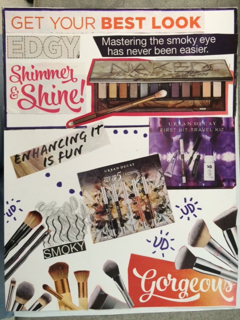
Urban Decay Collage Ad
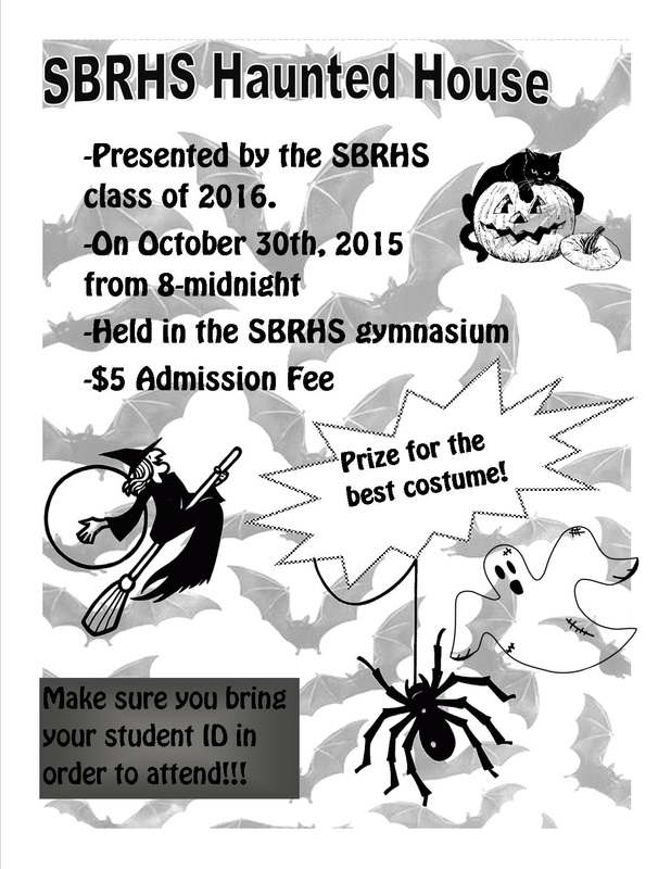
Flyers


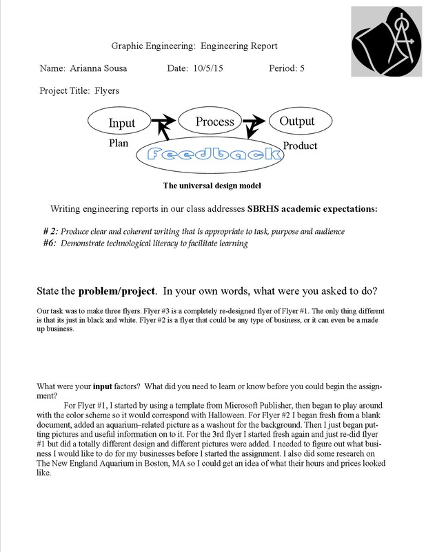
Engineering Report For Flyers
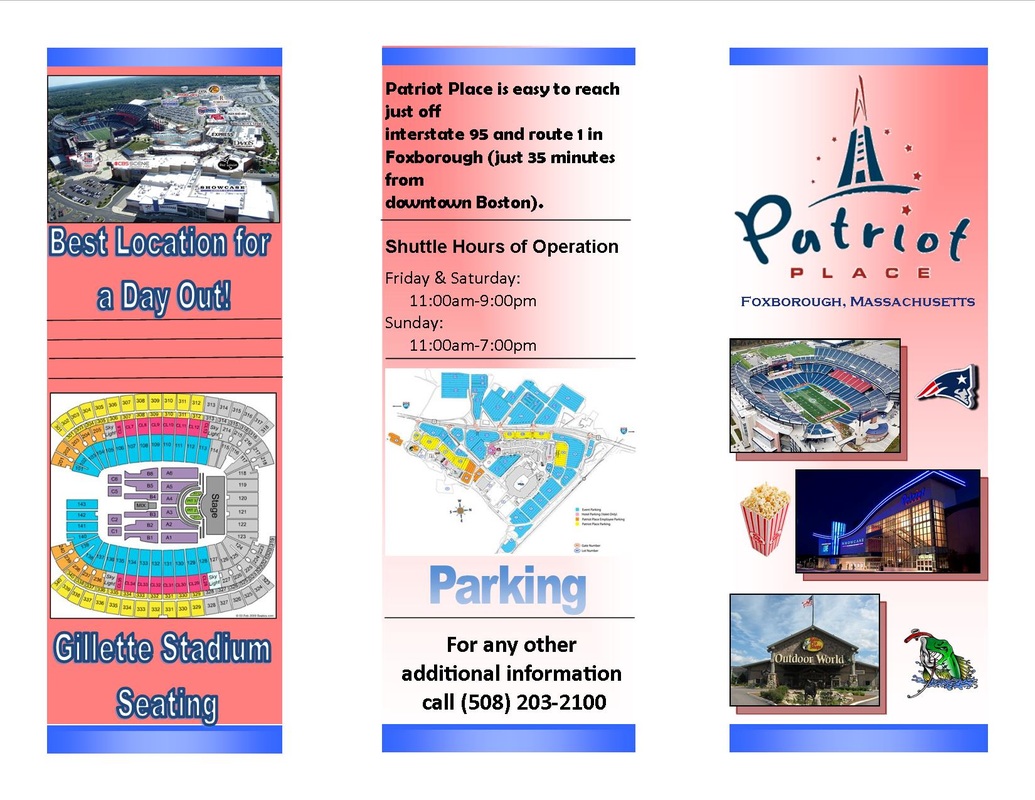
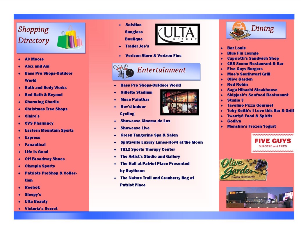
Practice Brochure: Patriot Place
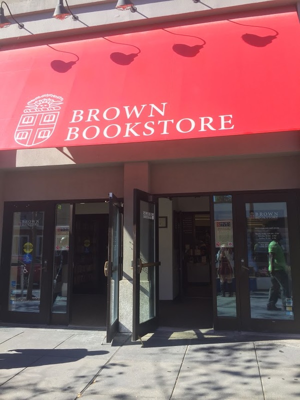
Thayer Street Brochure

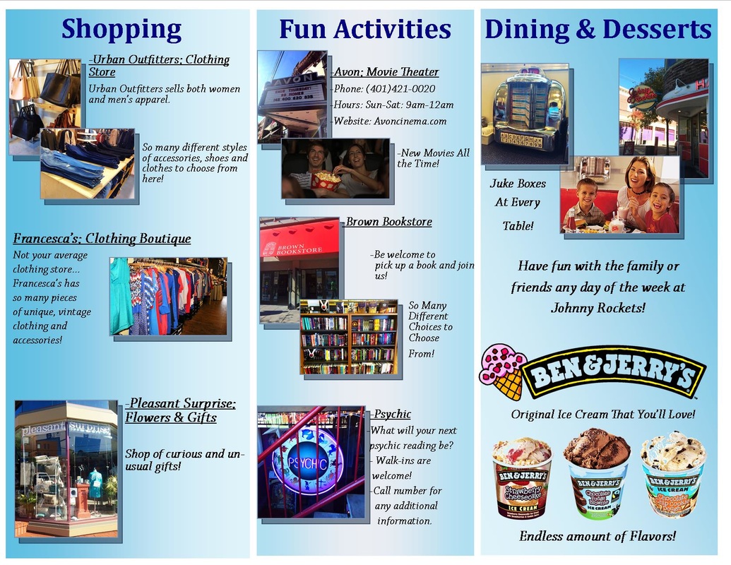
Image Modifications:
Original Edited
|
|
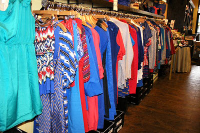
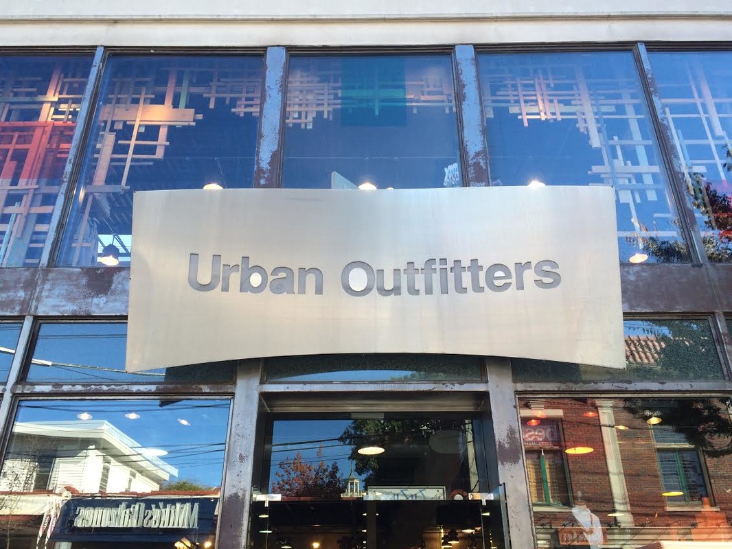
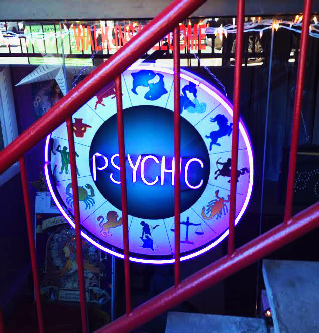
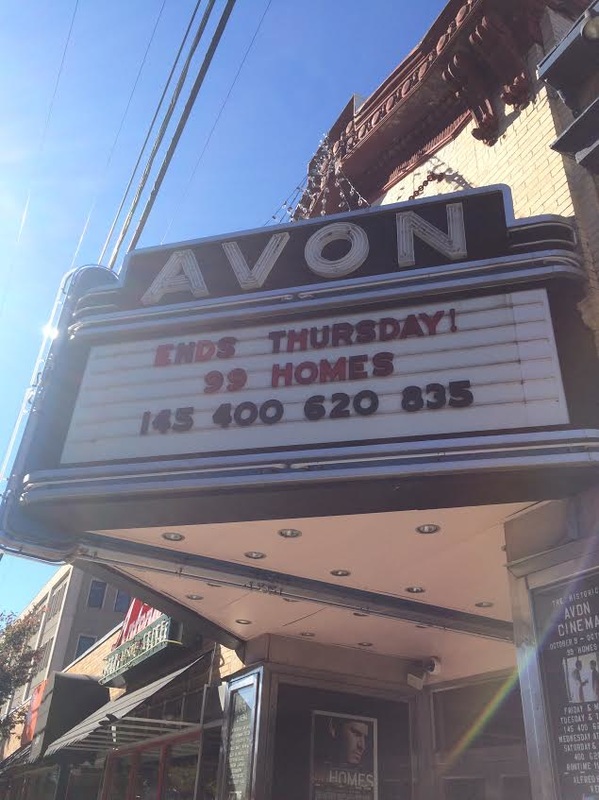
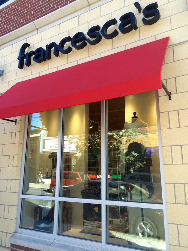
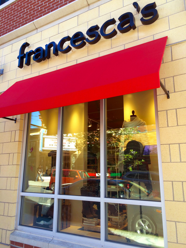
In this clothing rack from Francesca's, I brightened the contrast and I also made the colors more vibrant.
I made the edges sharper and I wanted to make the color red more eye-catching, so I made the colors more vibrant. I also tried to get rid of the glare from the sun For this one, I played around with levels, vibrancy, and contrast to make the picture of Urban Outfitters more appealing. My goal was to also sharpen up the edges here. I cropped this image of the psychic. I also wanted to make the glow from the sign more purple, and brighter so i used the brightness and vibrancy tool. The color of the railing was pretty dull, so I used the vibrancy tool for that also. The original photo I had taken of Avon, had a lot of glare from the sun to it, so i darkened it a lot and sharpened all of the edges to make it more bold. I used mostly the vibrancy tool in this one, and messed around with levels to make the photo look exactly how I wanted it to look. |