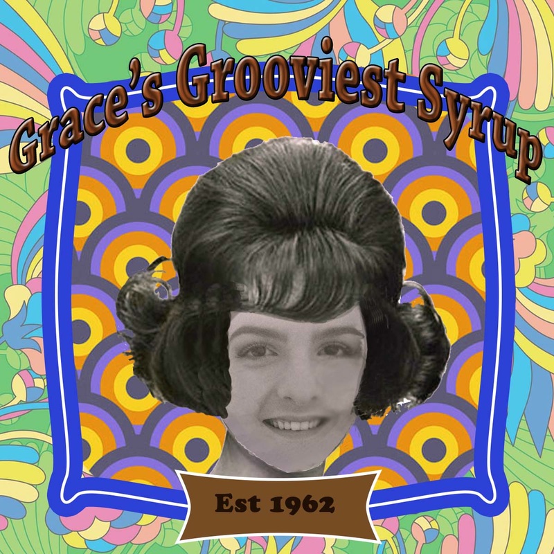
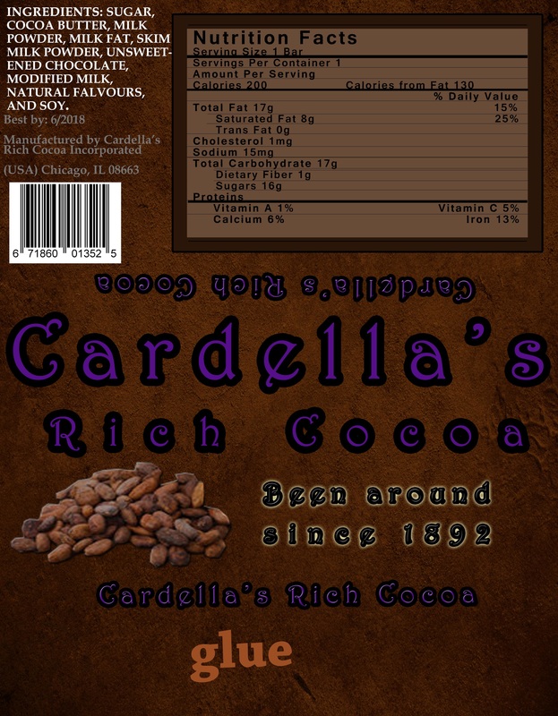
Syrup Logo
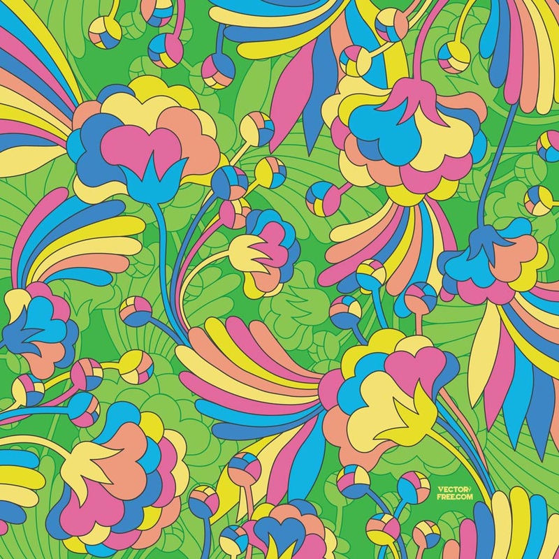
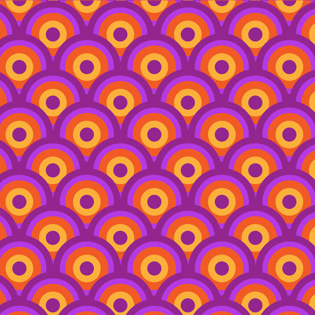
Original Images
Student Reflection
- What era does your logo represent?
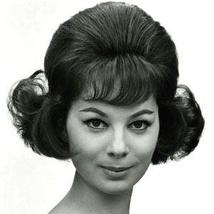
- 1962
- What design choices did you make to represent your era? (hair style, colors, fonts, prints or patterns, etc.)
- I used a big curly, short hairstyle to go along with the 1960s. I made the face black and white as well. I added wallpaper that looked retro and bright colored. I think the designs in the background made the logo eye catching as well.
- Are ALL logo project requirements fulfilled? (Edited photo, clipping mask, type on a bath, blending options, refine edge tool?)
- Yes, all of the requirements were fulfilled as well as using other layer styles, image adjustments, using shapes and banners, and using the crop tools such as the polygonal lasso tool.
- What tools did you use and where?
- I used layer styles, image adjustments, black and white, color balance to make my face and her neck match, using erasers, shapes, banners, the polygonal lasso tool, the clone stamp, and lowering the opacity of images to make the others stand out more. I also kept messing with the opacity of the eraser to make her hair look less edgy on my face, and to make it blend more on my face.
- Is there anything you wish you could add or change to make the logo look more professional? What are some other tools or pieces that can be added to make the most of Photoshop tools?
- I wish I could've come up with a better name for my syrup so it would be more catchy. I also wish I chose two backgrounds that matched more to each other and not so mis-matchy eve though this was the 1960s.
- I wish I could've come up with a better name for my syrup so it would be more catchy. I also wish I chose two backgrounds that matched more to each other and not so mis-matchy eve though this was the 1960s.
Chocolate Bar
Breakfast Pizza Recipe
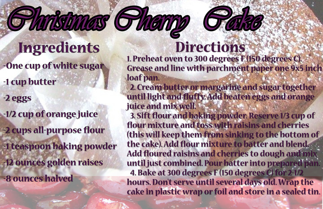
Christmas Cherry Cake Recipe